
Design system -
RingCentral Office
Challenge:
Improve the end to end design of current button system to increase usability and consistency
Deliverables:
Use cases inventory. Competitive research. Visual exploration. Documentation.
Role:
Product Design intern
Background
One of the projects I led in the RC UX team was designing for the Buttons. All of the RingCentral web products: Office, Glip, and Service Web had high needs for the buttons since there were many use cases where buttons were inconsistencies visually and in behaviors. Buttons are an essential element of RC design system. They have a primary role in the conversation between a user and the system.
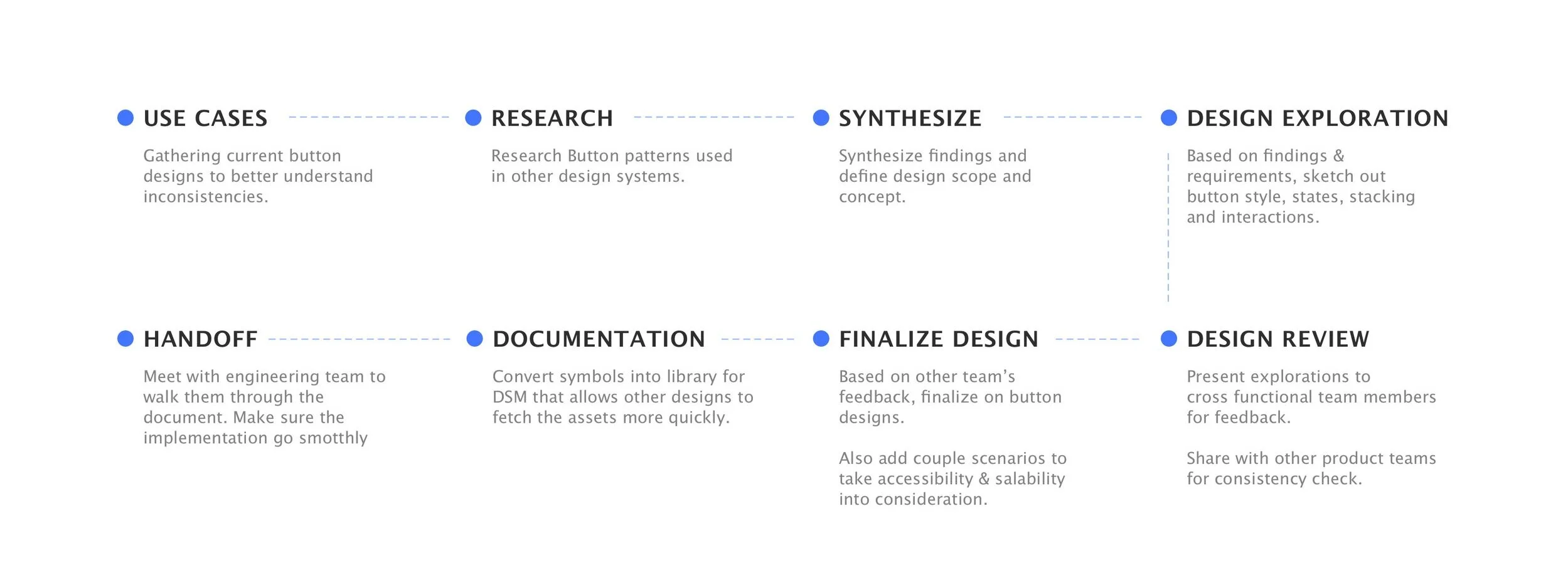
Process
I started out gathering all the use cases in current product to better understand the inconsistencies, then conducted competitive analysis for buttons used in other design systems. Based on the findings, I developed design options and reviewed with stakeholders. After a few rounds of iterations, I was able to finalize on the design and documentations. Lastly, China engineering team and I synced for handoff and implementation.
Use cases
By gathering the current buttons, I would like to find out:
1. Buttons types
2. Multiple buttons: How would they stack?
3. Button usage (Primary/Secondary/FAB )
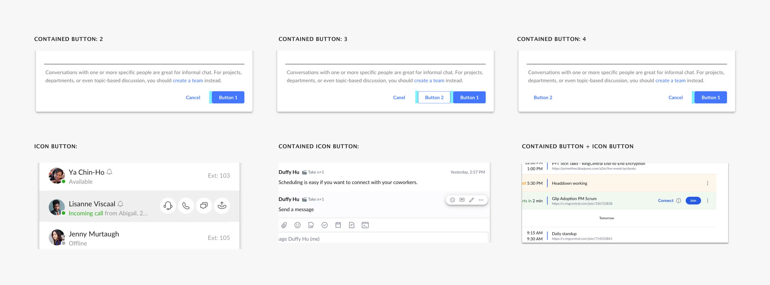
Inventory
It appeared all buttons being used have way too many different visual variances that are not necessary. They are inconsistent in terms of size, design, states, content rules, and interaction.
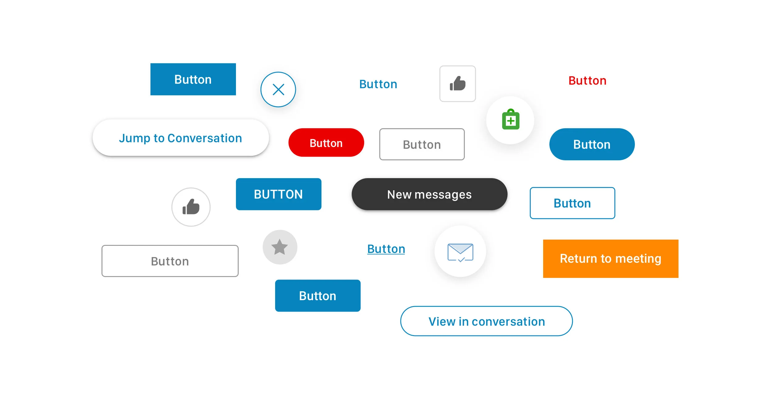
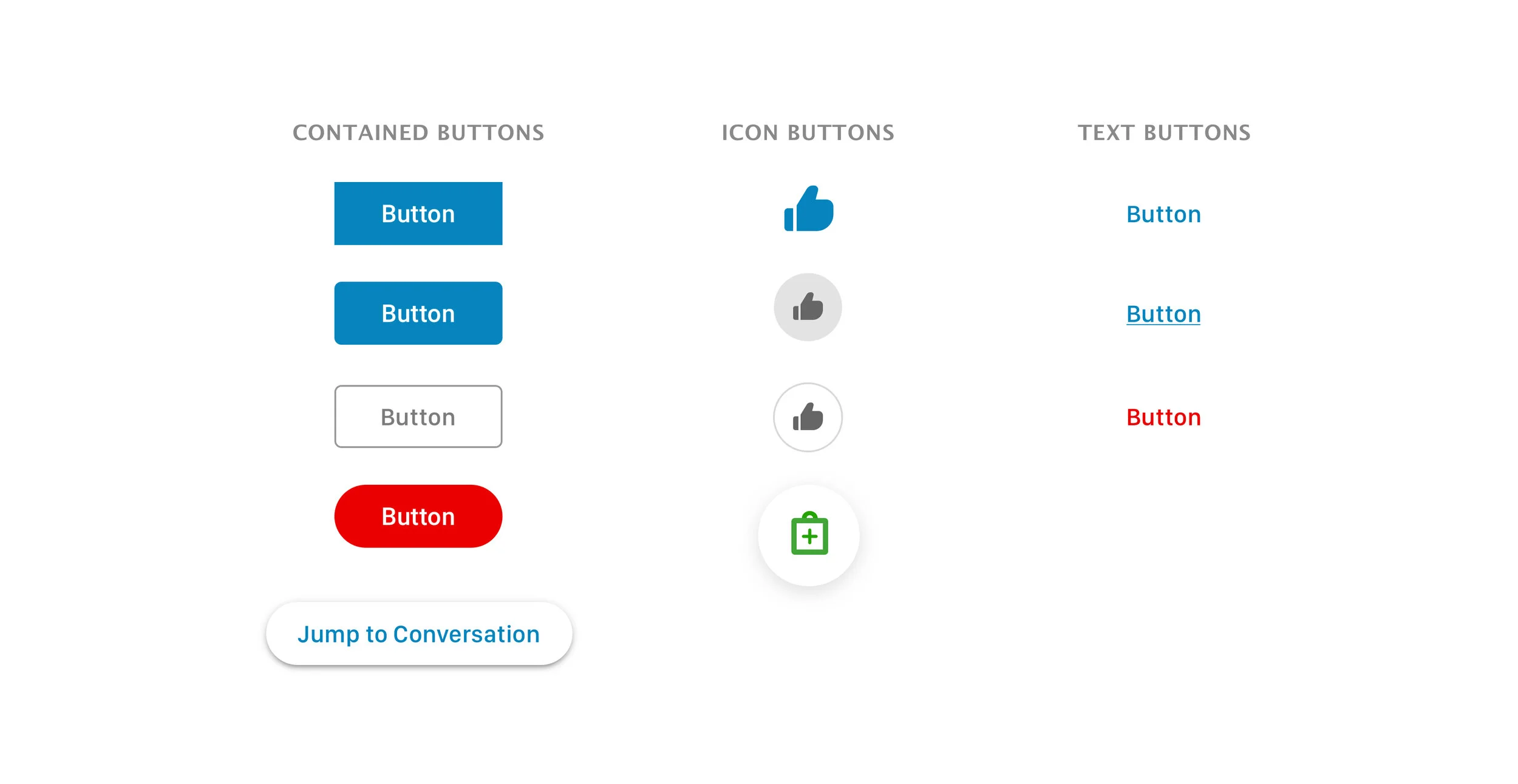
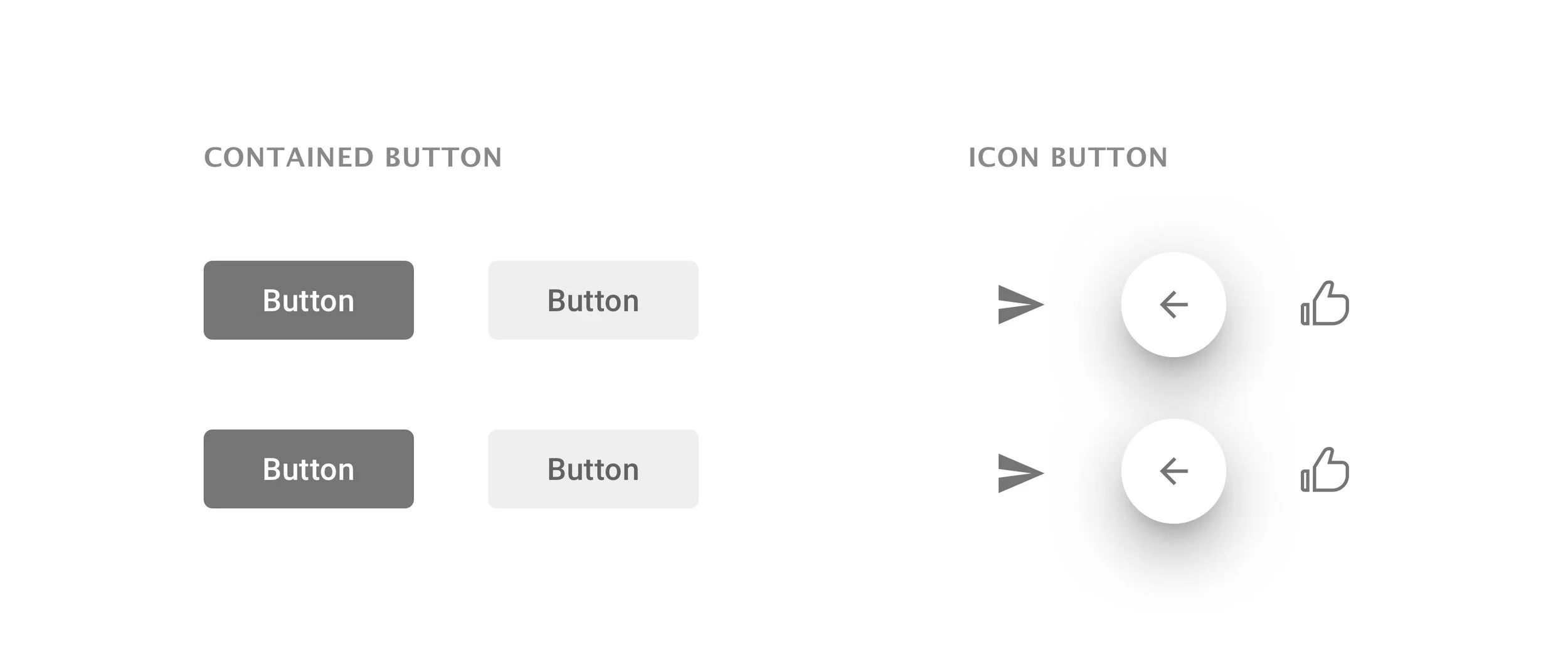
After discussing with cross-platform teams, I divided the current use cases as Contained, Icon, and Text buttons.
Research
Competitive research
After I gathered the use cases, I explored on how other products are using their buttons:
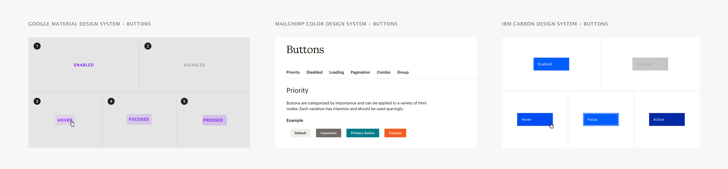
Synthesize and findings
Based on the different design systems I studied and current button use cases, I recognized some areas I wanted to focus on during this redesign:
1. Multiple button stacking should have clear visual hierarchy;
2. Button states should be defined properly;
3. Buttons should have consistent voice & tone, style, size and interaction.
Visual explorations
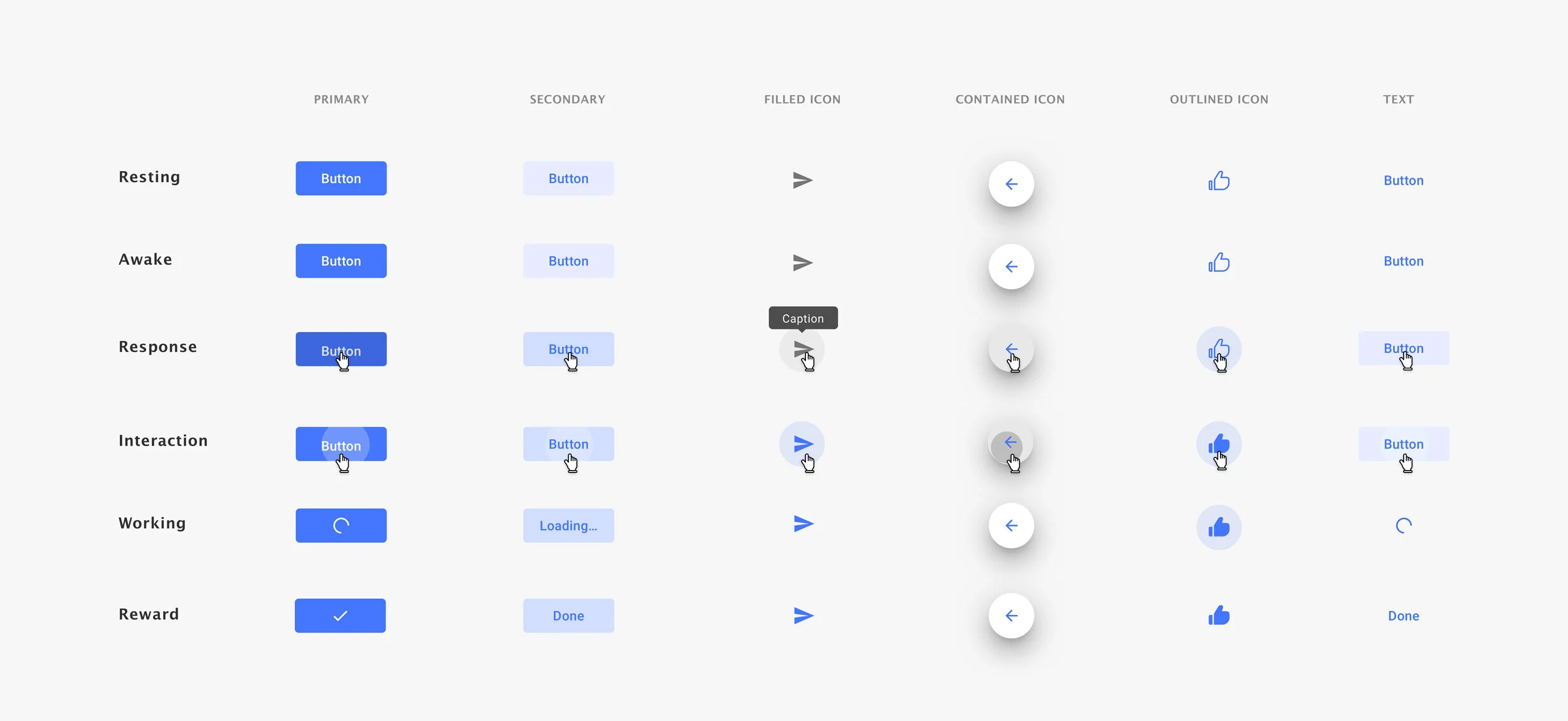
Button state concept
I defined a total of 6 button states based on current button behaviors and explored couple visual options to circulate with designs on several teams. During the sketching, I kept referring to the current design system and made sure they stay in the same style family:
Design for accessibility
I also made sure to the colors being used from the color palette are passing the accessibility contrast test, so that EVERYONE could quickly pick up different status of the notification messages. The great thing about making our work accessible is that it brings a better experience to EVERYONE.
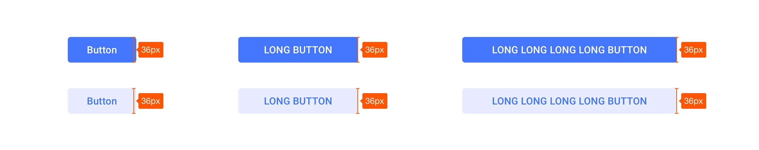
Design for scalability
I also considered the use cases on how we should deal with the overflow of the text. Through design review session, I was able to get other designers’ opinions on which one would fit better into diverse use cases. After looking at various use cases, we decided to go with the Fixed Width since it looks more consistent and organized.
Button stacking
After nailing down the details for individual buttons, I started develop the layout for button components that are widely used in the product. I took production screens and tried couple options to stack the buttons in different ways. During which, I kept reference back the whole design system for paddings and style guide to make sure these are consistent.
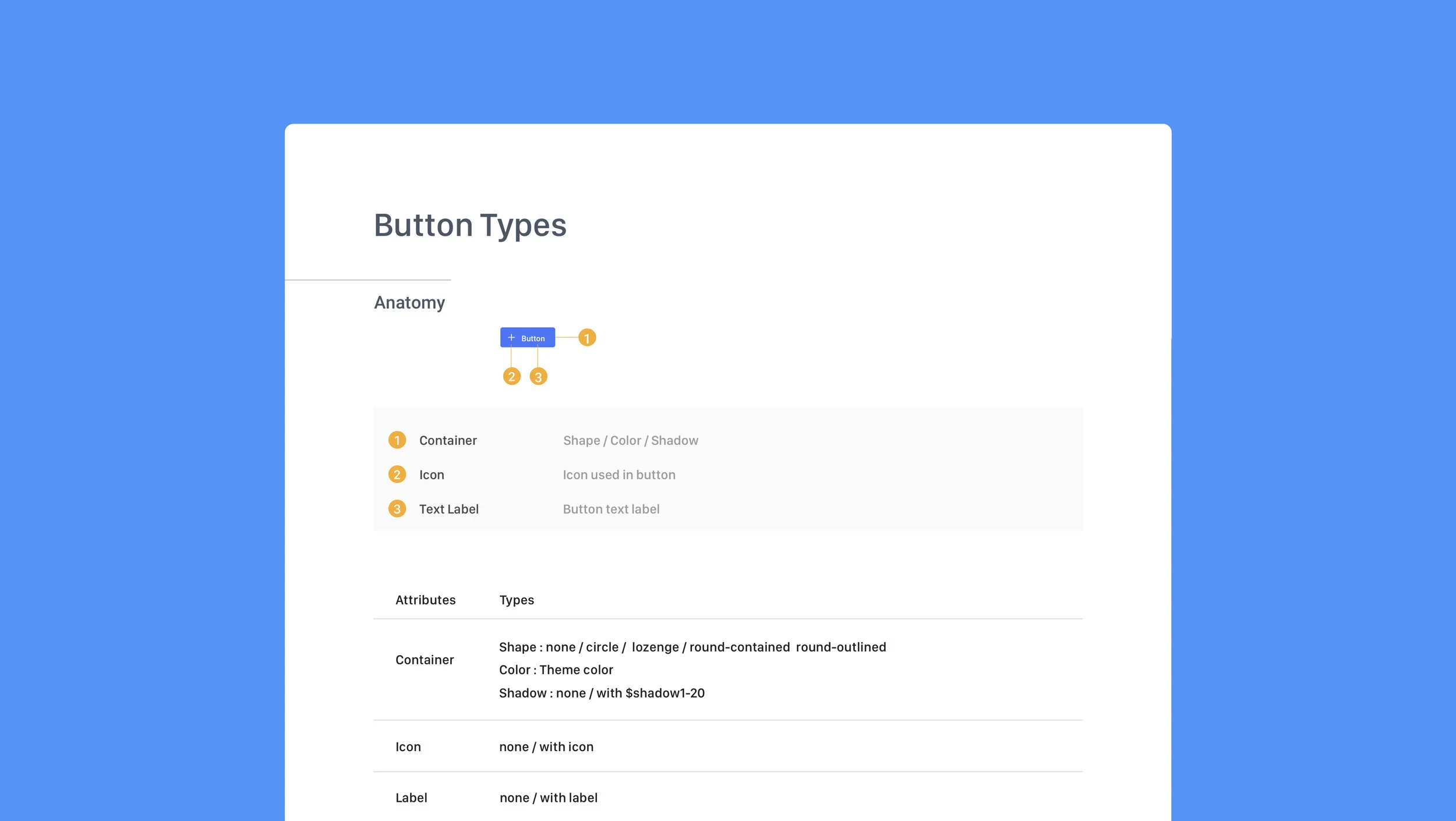
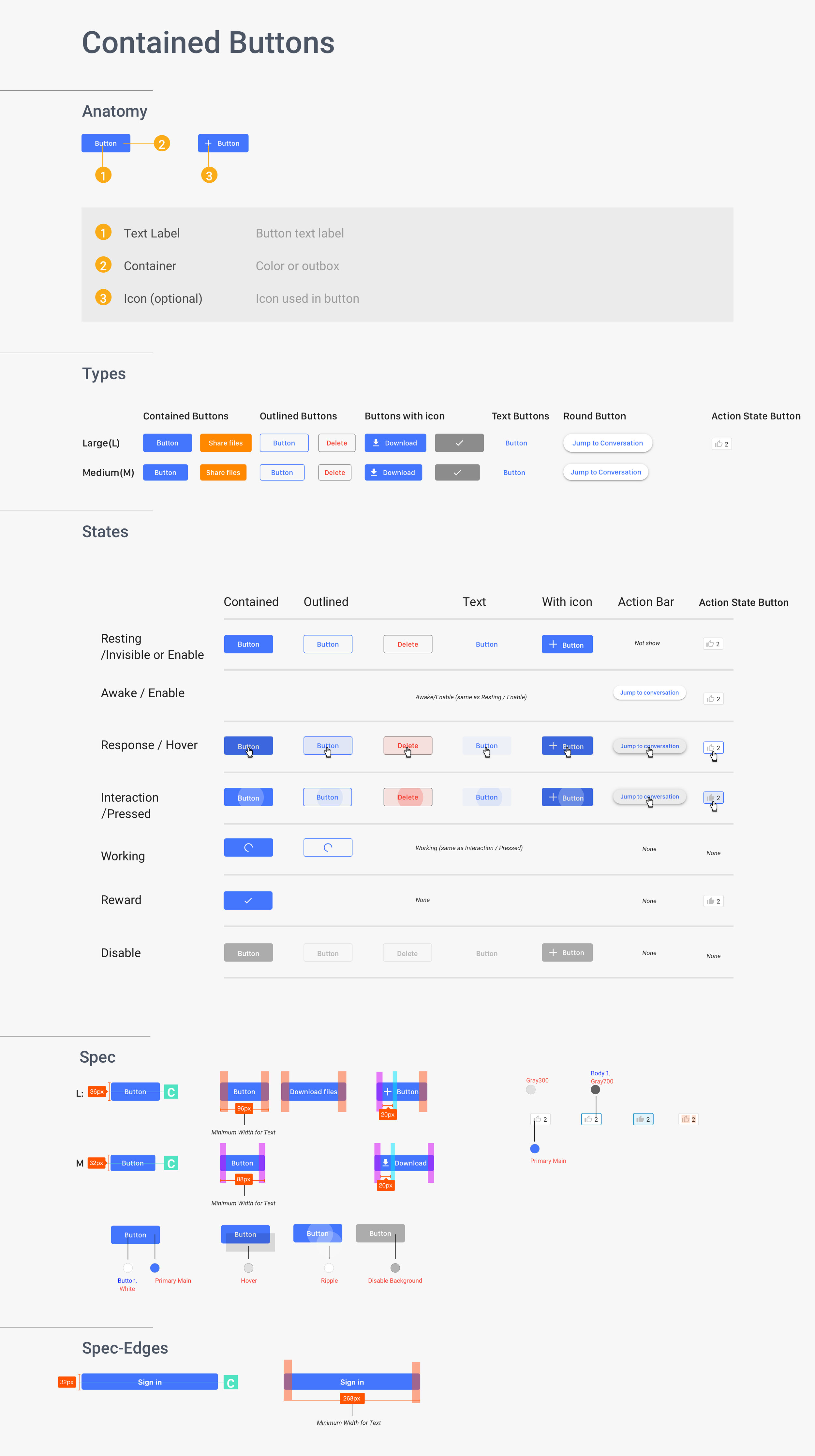
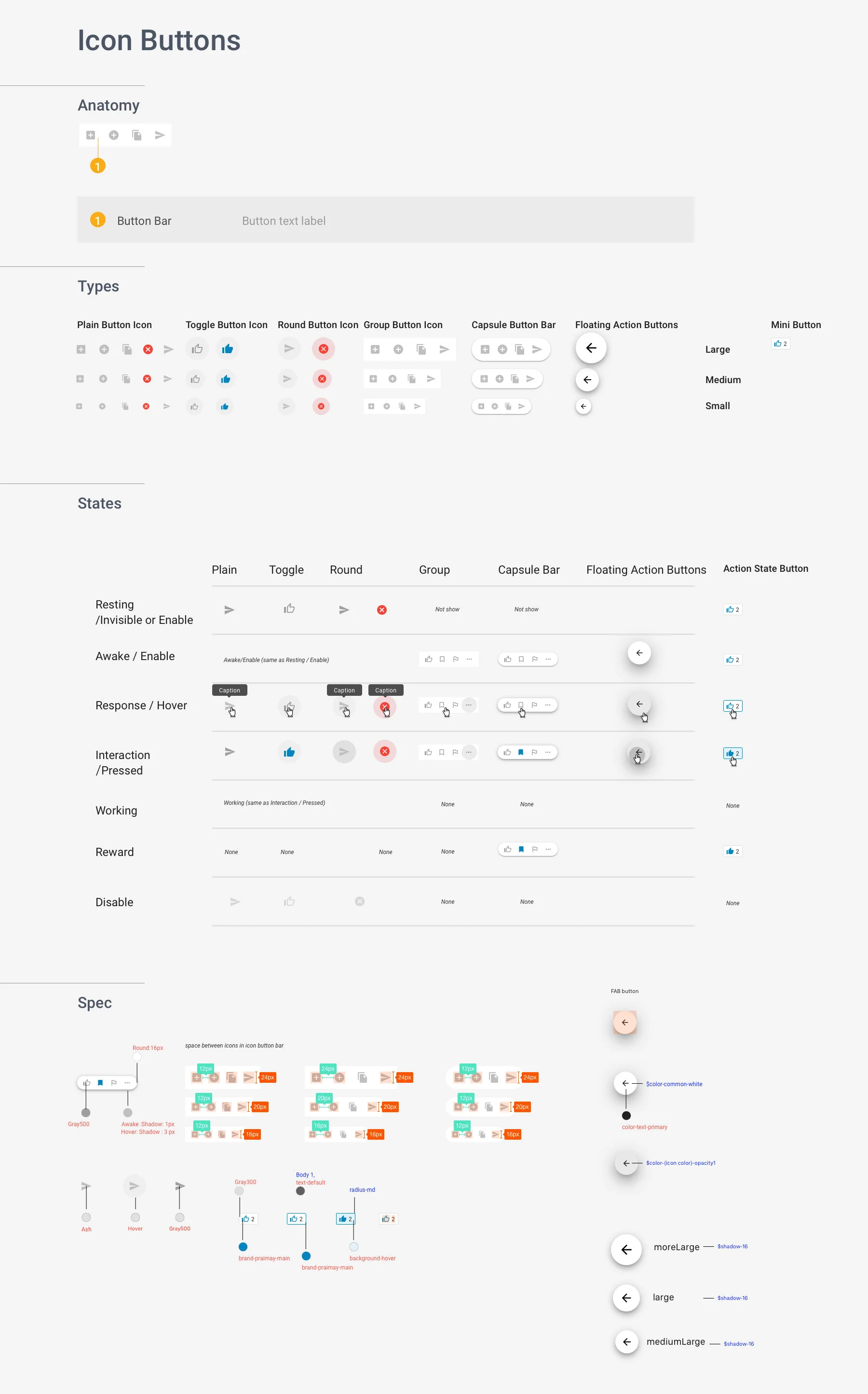
Final documentation
After discussing with our engineering team in Xiamen, China. We planned on delivering the button spec that contains button Anatomy, Types, States, Paddings, which helps engineers better structure the buttons as code system that is more scalable and efficient.
Key learnings
🎯Define the project scope
It is important to understand the context and technical constraints when you design. Narrowing down the requirements in the beginning with stakeholders became very helpful to keep you on the right track and on the right time.
✨User friendly design
Make sure you understand who your key audience are. Designing for each customer with delight is important when it comes to craft your design for a better solution.
🔑Design with reason
I learned that product design needs to be intentional. Constantly asking yourself the reason behind every little change. It is significant that our team members understand the design, but we also need to “convince” our users.