
Design challenge -
Spotify social features
Challenge:
Create a mobile experience that help users share their stories about songs
Deliverables:
Business model. Value proposition. Persona. Site map. User flows. Sketches. UI. Prototype.
Role:
Product Designer
Spotify is a digital music service that gives you access to millions of songs, where you can discover new music, albums, playlists and podcasts.
Background:
To me, music is not just pleasing mixture of beats we listen to while working, cooking or spacing out, they also carry certain emotional pieces related to life experiences. With Spotify, I often find myself switching platforms to find more information about a song or just how other people feel about it.
That’s when I realize - the potential for greater connection between people and music is huge. So the challenge becomes: How might we improve Spotify experience to create a better music community?
Process
I started the process with business model analysis to understand Spotify’s core customer value, then mapped out value proposition, based on which I defined the design concepts and strategies. I developed the concept into UI sketches and tested it with customers. It was then translated into hi-fi prototypes. The project timeline is 5 days. Now let’s go deeper into each step:
Research
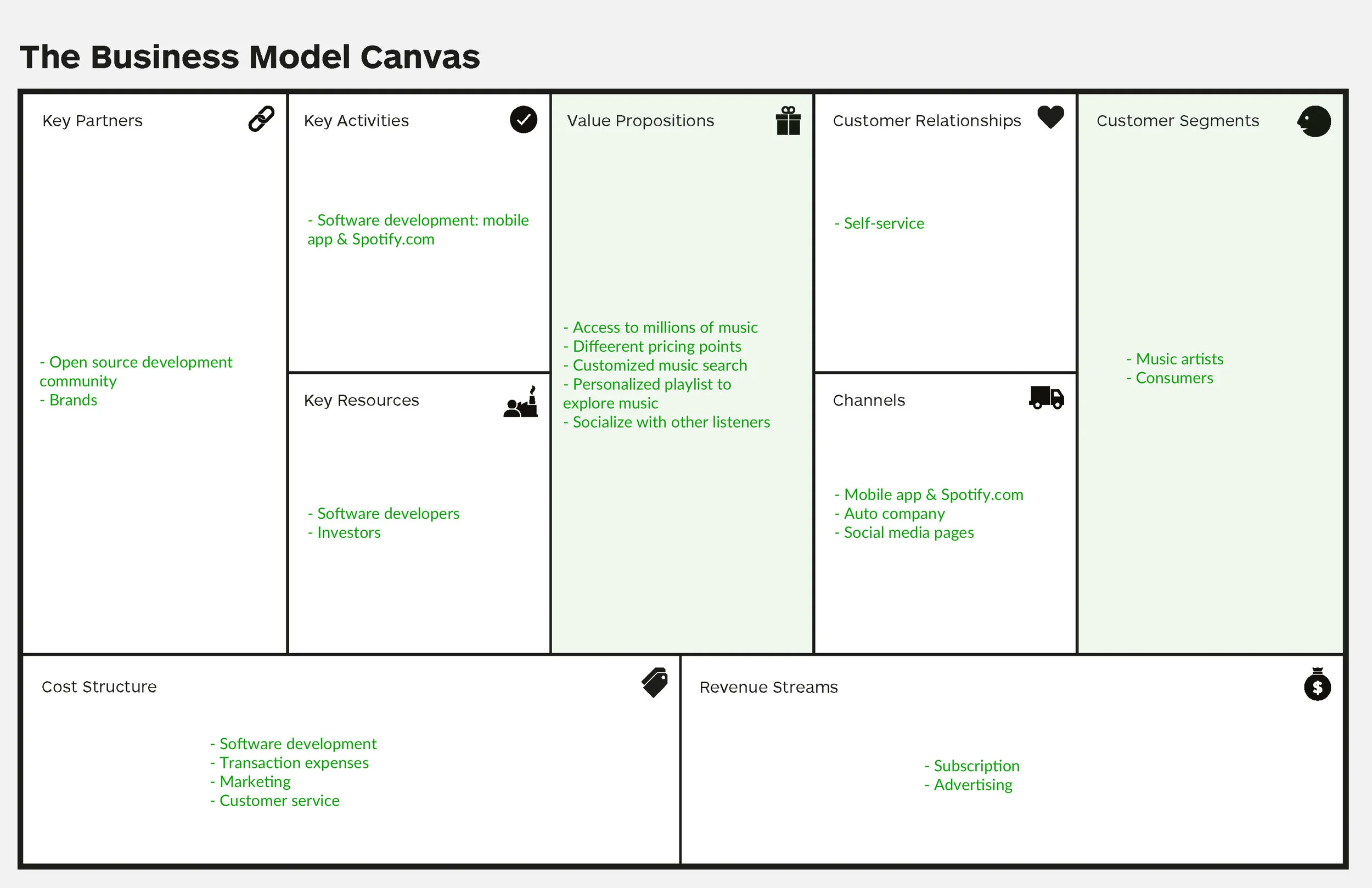
Business model analysis
I delved into Spotify’s business model with the help of data from this website, to better understand how Spotify creates, delivers, and captures customer value.
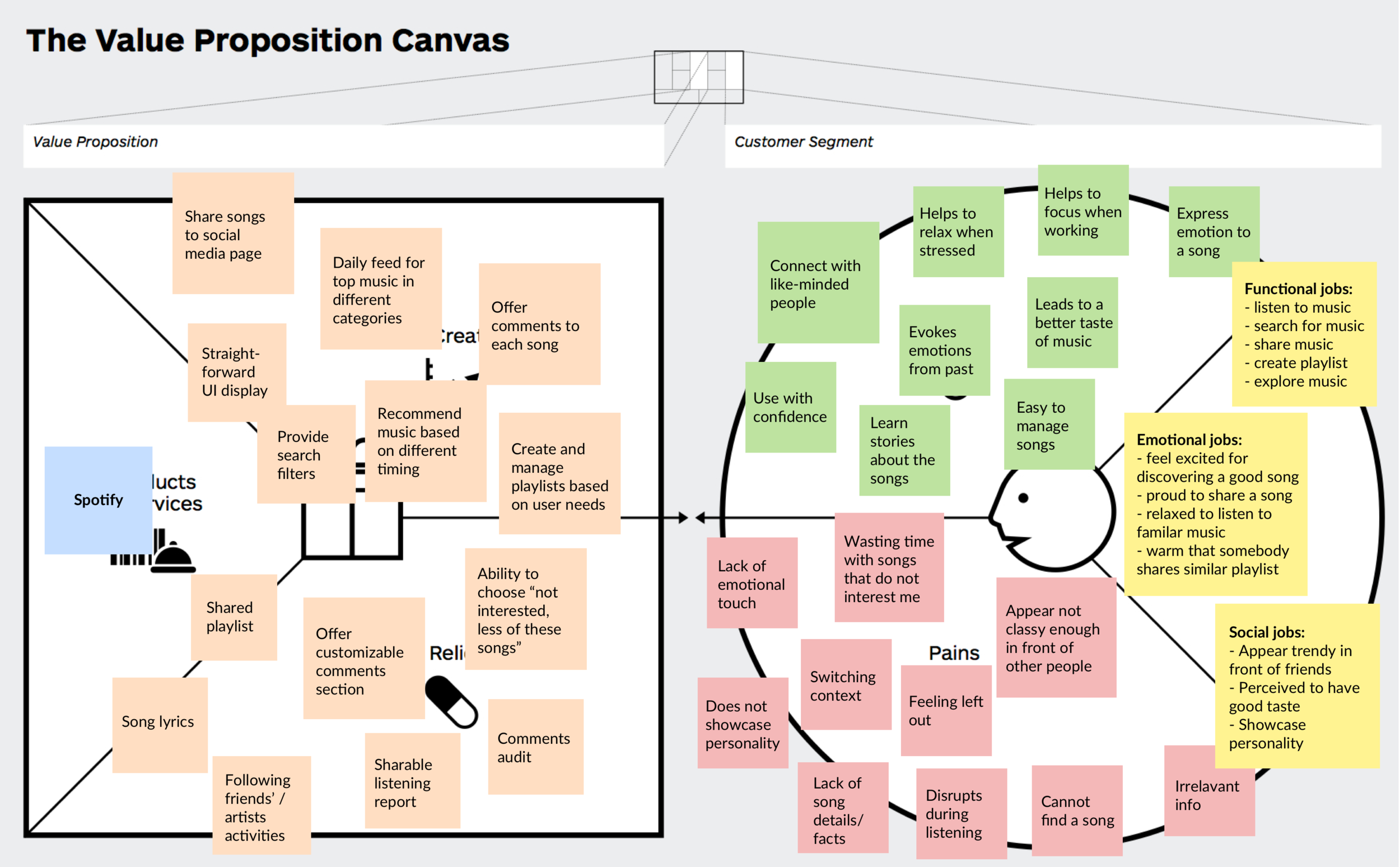
Value proposition mapping
After analyzing the business model, I mapped out the value proposition map corresponding to the model, to dig deeper into the problems, uncover customer pain point for the existing products.
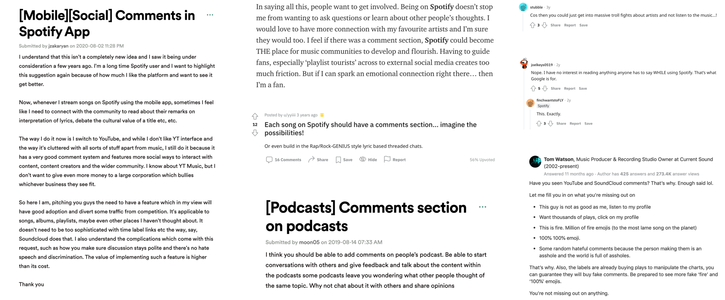
Creating music community is not a new idea - Why hasn’t Spotify hasn’t explored on this?
I dug a little deeper into Spotify community, Quora and Reddit, for the reasons people like or hate for Spotify being social:
With the current value proposition map in mind, combined with the findings from real customer feedback, I refined the Value proposition map:
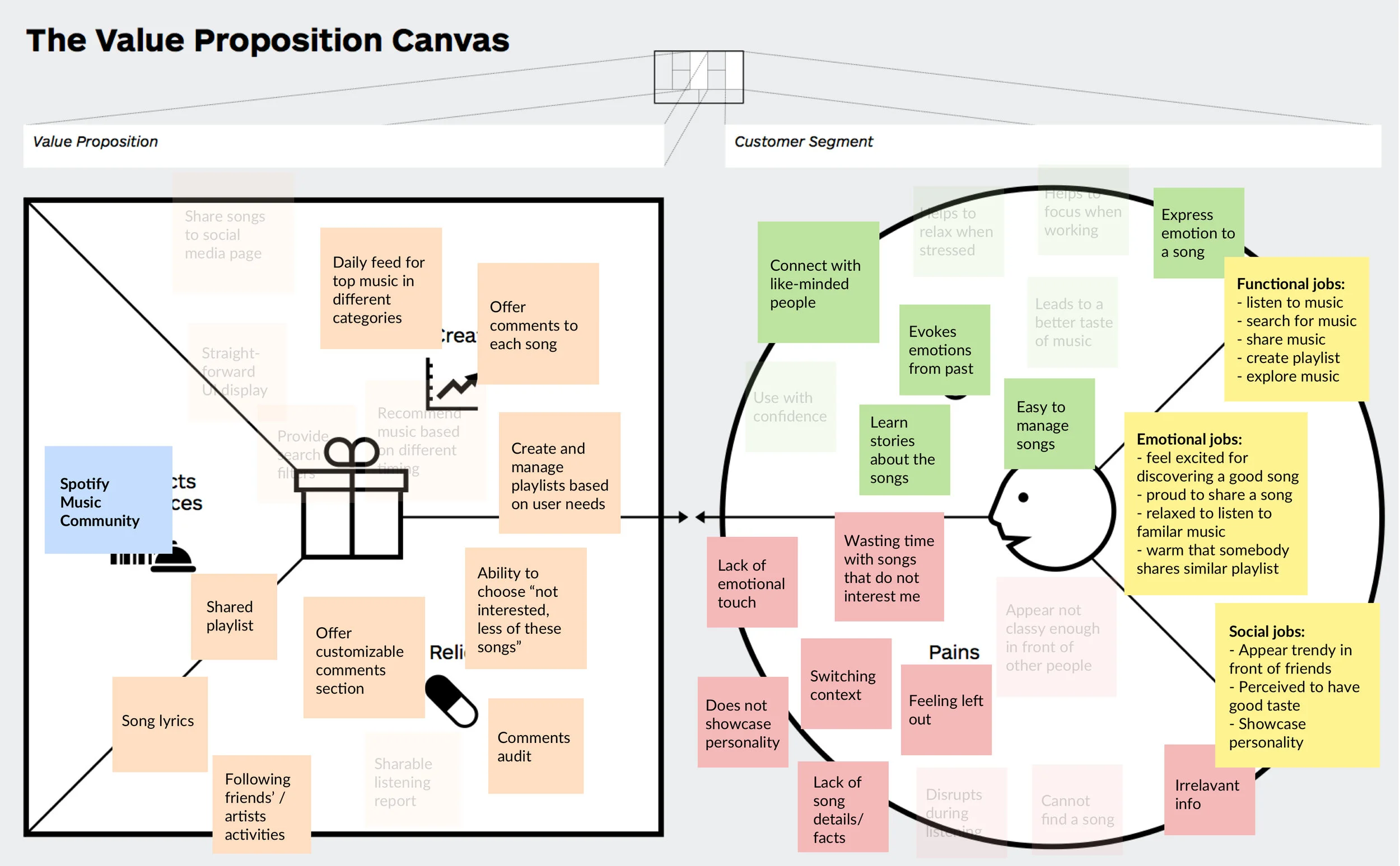
Based on the findings, here are the 3 areas I believe could be addressed to improve the experience and retain customers:
1. Customers are not happy when they cannot showcase their personality
2. Playlists are difficult to manage based on customer preference
3. Customers feel bad when they think they are left out
Ideate
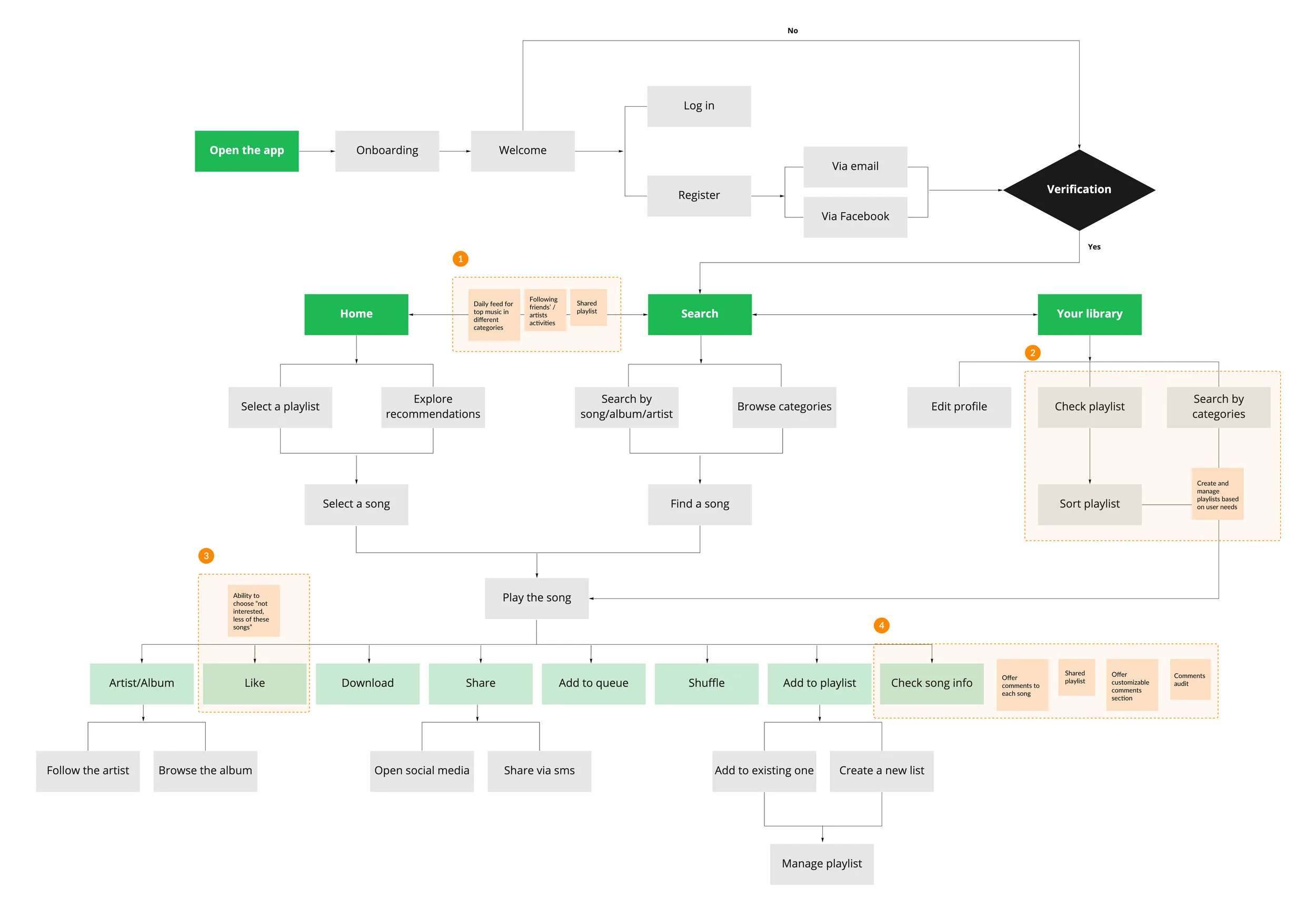
User Flows
To help communicate the concept and information architecture, I created task flows for 3 pages to better understand where in the process potential customer value can be created, I highlighted the areas in orange to reflect corresponding solutions:
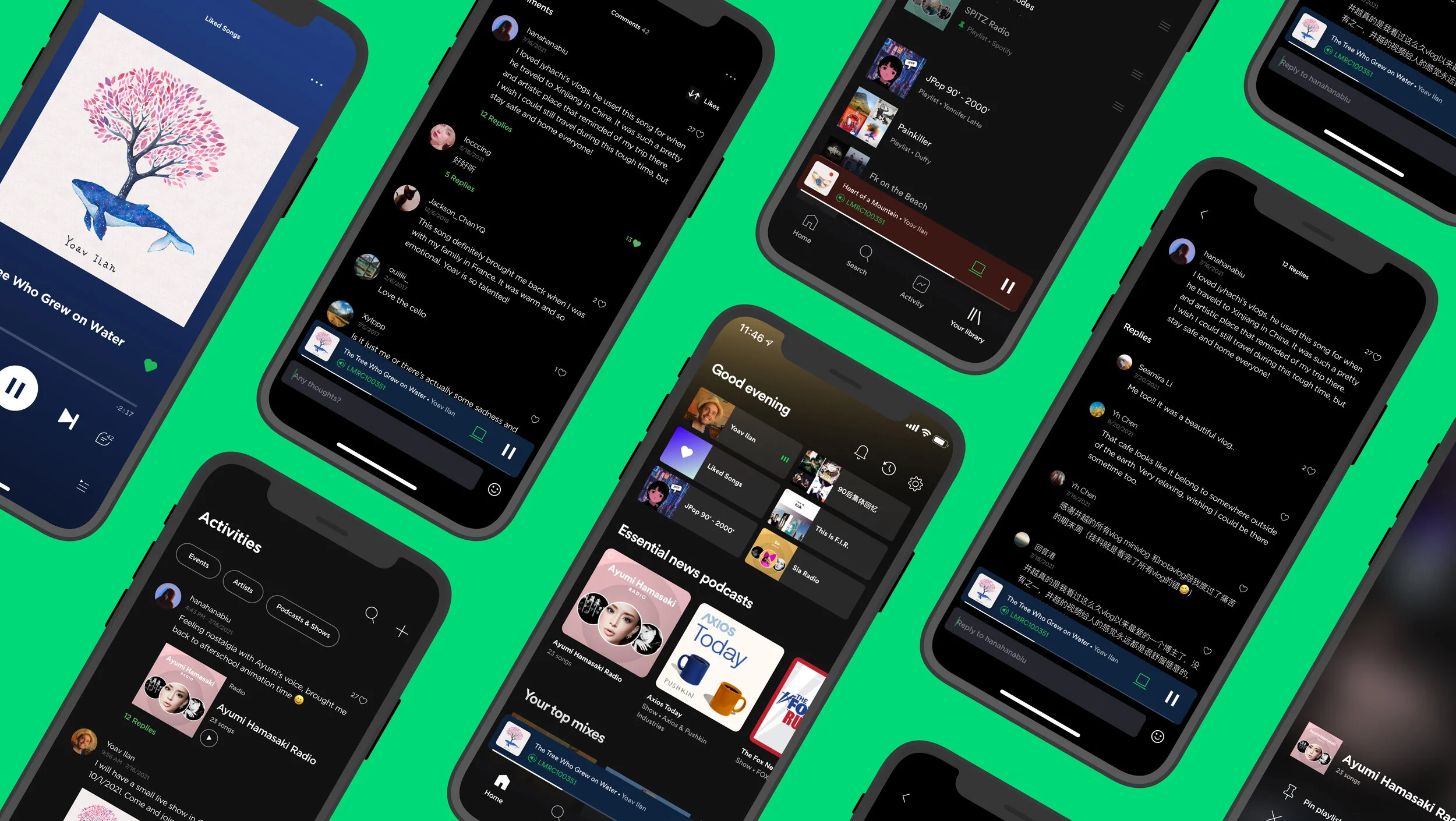
Lo-Fi Sketches
I sketched multiple options for each screen, continually referencing the target audience, company mission and objectives to share successful stories with customers.
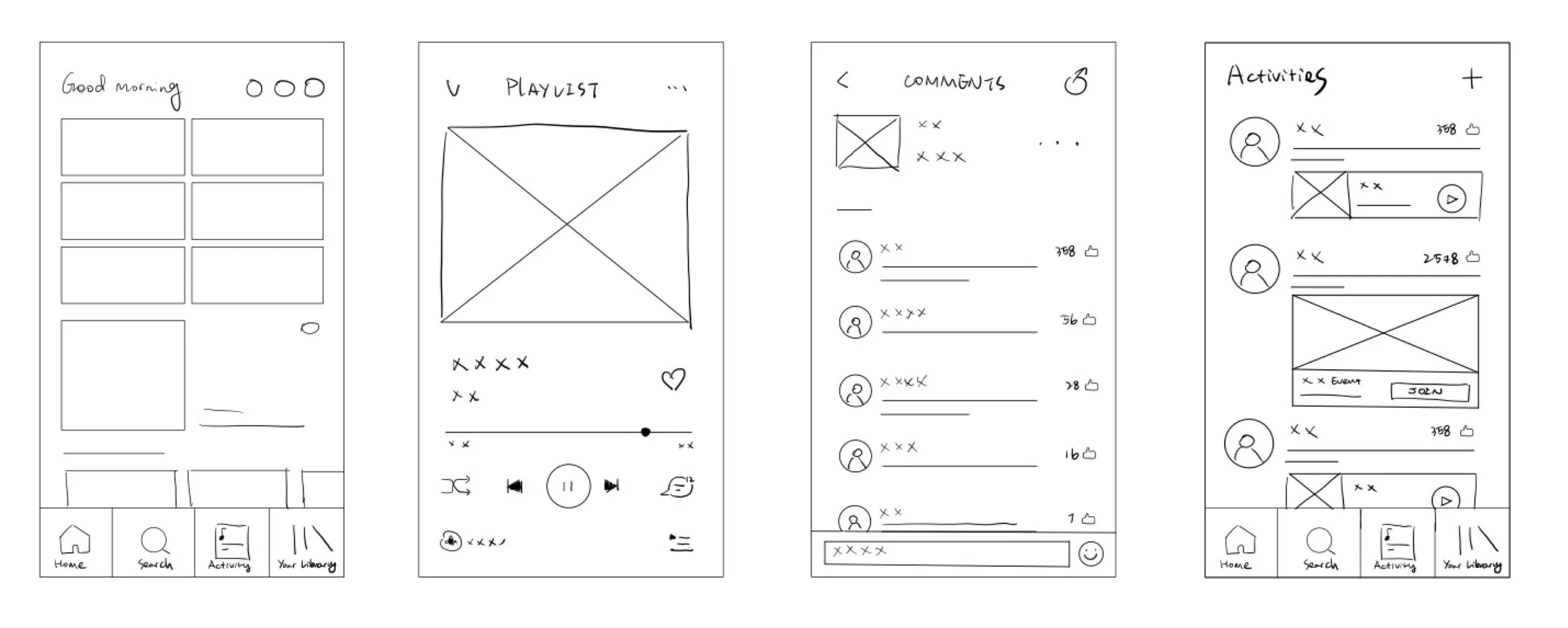
Base on the customer research findings, I prioritized three main objectives:
1. Provide a platform where customers can comment on songs to share stories with each other easily and check on other people’s replies;
2. Provide a platform where customers can keep track of what is happening with people they follow and what is going on in music industry;
3. Provide a platform where customers can customize the playlists saved more freely.
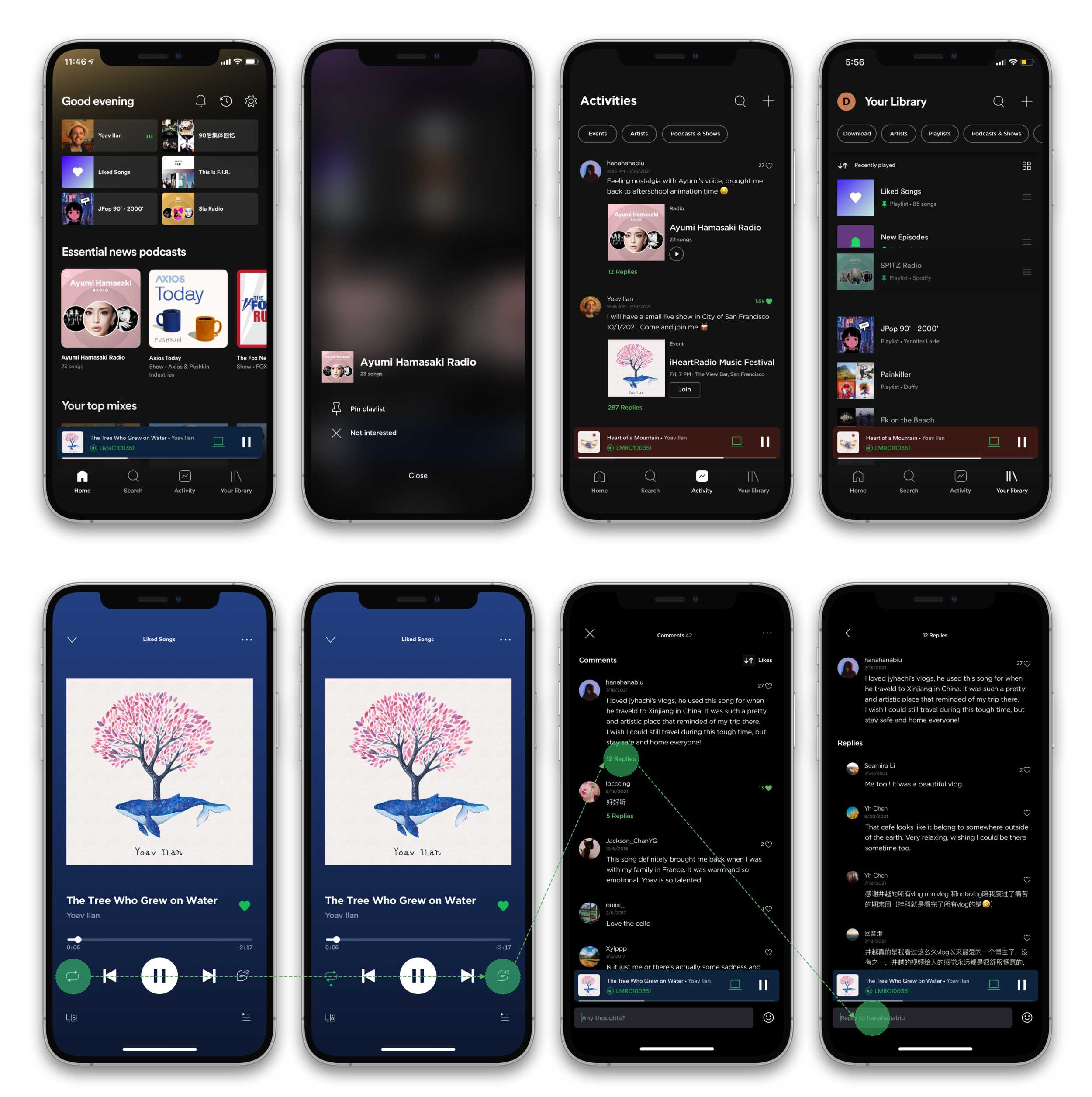
Prototype
During this phase I iterated the design based on Lo-Fi validation findings. I learned that there were still some confusion around how to comment on songs and customize the playlists. Therefore, I focused on improving the above while finalizing the UI design.
What I learned
During the 5 days of this challenge, I was very passionate because I use Spotify everyday for at least 1 hr. I was happy to solve problems that are actually happening to me and other Spotify customers. Here are some takeaways that I would like to share during this design experience:
1. Understanding the true user needs is important
When I first decided to do this project, I was making all sorts of assumptions. However, when I got to delve into user research, I found that the feedback that the customers have is a little different than what I imagined. So instead of going deeper with my own concepts, digging more into user feedback is the right way to help curate the solutions.
2. Providing essential and delightful experience matters
When it comes to redesigning, people tend to get lost in flashy visuals and interactions. However, when I did research and analysis, I found that users just want the product to be “most useful” for them. They have a clear purpose when using this product and what they want is to feel satisfied after using the app.